Five Ways to Reinvent Your Fireplace
Fireplaces are possibly my favorite thing to design (like the one from this project which has gone absolutely viral on Pinterest) because they provide a blank canvas that can become a focal point for the home that expresses its point of view and personality. This is a design element to consider in terms of mood or emotion—do you want your home to be fun and playful? Or romantic and elegant? Cerebral or passionate . . . read on to learn how to encourage a fireplace's main character energy.
It’s finally fireside season! While you spend time in front of yours, or just dreaming of your future fireplace, I’m here to encourage you to dream big.
Fireplaces are possibly my favorite thing to design (like the one from this project which has gone absolutely viral on Pinterest) because they provide a blank canvas that can become a focal point for the home that expresses its point of view and personality. This is a design element to consider in terms of mood or emotion—do you want your home to be fun and playful? Or romantic and elegant? Cerebral or passionate?
Once you’ve identified the feeling you want to convey, you can select materials and forms that speak in that register. I recommend getting creative and going bold when it comes to fireplaces because they are a great place for a design element that stands alone and can do a lot of the talking for the rest of the house. Here are a few ideas to encourage that big main character energy.
1.
Play with Plaster
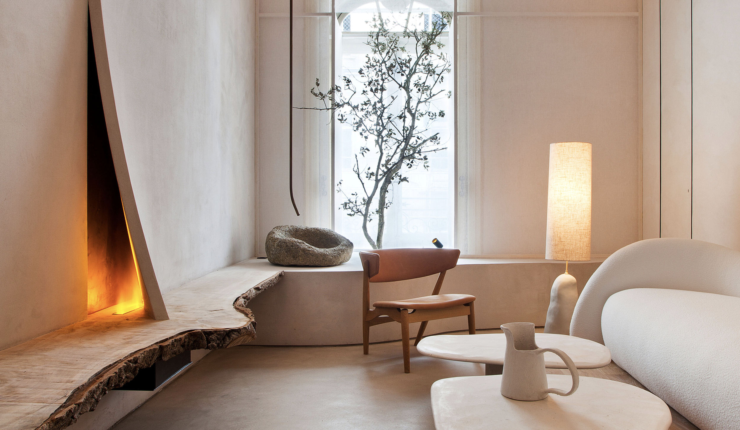
Plaster has made a comeback recently in many new finishes and colors because it’s a material that allows for so much creativity. Here’s a few ideas to consider:
Select colored plaster in moody hues
Form arcs, curves and reliefs: sculptural forms cohere beneath a plaster finish
Opt for movement and texture in your finish application
Swath an entire facade in one serene color or mix colorful plaster elements with equally interesting tile or stone.
Design: The Brain and the Brawn
2.
Rethink Brick
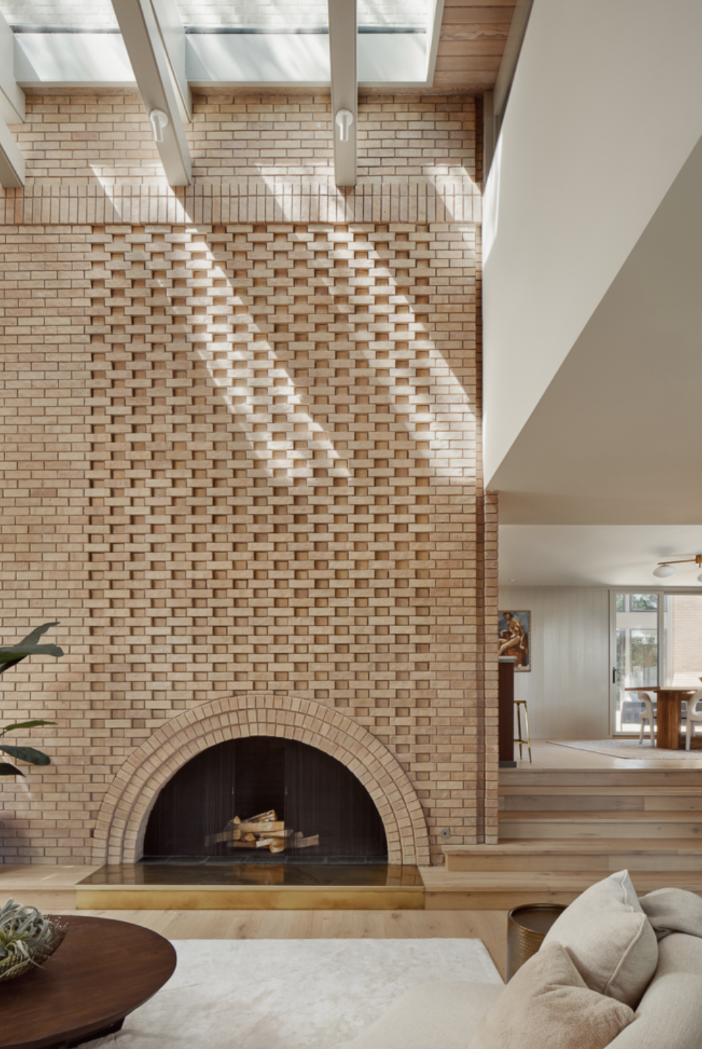
A brick fireplace is a common classic, but don’t count brick out if you want to make a bold statement. Here’s a few ways to rethink it:
Apply different patterns to one facade for a custom yet classic look.
Consider some asymmetry to modernize the material.
Carry the brick onto adjacent walls, hearths, and other architectural elements for a feature wall finish.
Install brick vertically for a modern take on a traditional material.
Design: Webber + Studio
3.
Let Stone Speak
Stone is a venerable fireplace material, possibly the oldest one, but a new perspective can still yield exciting results.
Colored stone offers fun and bravado
Don’t discount the drama of a slab, whether at the hearth or framing the firebox—the more rustic the better.
Modern shapes and asymmetrical forms can be a great balance against this old-world material.
Design: Rudolph W. Schindler
4.
Tap the Creativity of Tile
Tile provides the easiest way to pack a punch. Here’s just a few ways to use it to make your fireplace a statement piece:
Go bold with color, even or especially in contrast with the rest of the room. Why should your fireplace blend in when it’s perfectly positioned to stand out?
Embrace iridescence (as in the case of zellige) or even metallics. There are so many cool tile finishes in gunmetal, gold, and mercury right now.
Use patterned tile as an accent—adorn a hearth, or the inside of a firebox with something surprising and special.
Design: Jessica Helgerson
5.
Take a Twist on Traditional
There’s nothing like a traditional mantel to gather around. But a non-traditional treatment can elevate it into an artful experience.
Strip an old mantel whose character has become coated in too many layers of paint to reveal its elemental warmth.
Conversely, a bold paint choice can give an old mantel new life.
Interpret traditional forms into new materials for a look that is fresh and playful yet honors the past
Design: Matt McKay
Thanks for reading! I hope these ideas give you something exciting to dream about on cozy nights spent staring into the flames of a lit hearth.
Five Ways to Style your Bed for A Refresh
Updating your bed’s styling can be an easy way to make your home feel newly fresh for the season. To that end, here’s a bit of inspiration, with easy ways to get the look . . .
Moore House Design
If you’re the kind of person who likes to switch out your flannel sheets for cotton ones around this time of year, this might be your moment to take things a step further. Updating your bed’s styling can be an easy way to make your home feel newly fresh for the season. To that end, here’s a bit of inspiration, with easy ways to get the look.
1.
Add Textiles to Your Headboard
While working with a designer to source fabric for a custom headboard is the most luxurious way to apply this idea, it’s not the only one!
You can easily drape a vintage textile, special fabric, or even a blanket or tapestry over a wooden headboard for an exiting new accent. And if your headboard is already upholstered, you may be able to use a staple gun to easily apply a new fabric over the old, either over the entirety of it, or in an artful swath, leaving the edges of the existing fabric to peek out in contrast.
Design: Kelly Wearstler
2.
Suggest Architectural Detail with a Folding Screen
Screens add dimension and texture, and can be placed behind an existing headboard or replace it completely!
Look for vintage folding screens or purchase a simple one and wallpaper it. This is such an easy way to transform your bedroom.
Design: Sarah Sherman Samuel
3.
Consider a Well-Placed Ruffle
All things Grandma-chic and girlhood-adjacent are trending right now, and if this appeals to your nostalgia, there are some lovely updated options to try.
A ruffled accent pillow or bedskirt is completely low risk and a darling warm-weather accent. Or you can go all in with a drapey bedcover and ruffled shams. I love this look for adding softness to a minimal space, or charm to a rustic one.
4.
Mix it Up with Contrasting Accents
This one takes a little creativity—look at what you currently love in your bedding and add an unexpected element.
If your bedding is minimal, add a patterned throw or beribboned pillowcase. If it’s linen, add velvet. If it’s neutral, add some colored sheets for a surprising detail. Rich interiors are rarely one-note, and its the unexpected that often enlivens a space.
Design: Studio Gutgow
5.
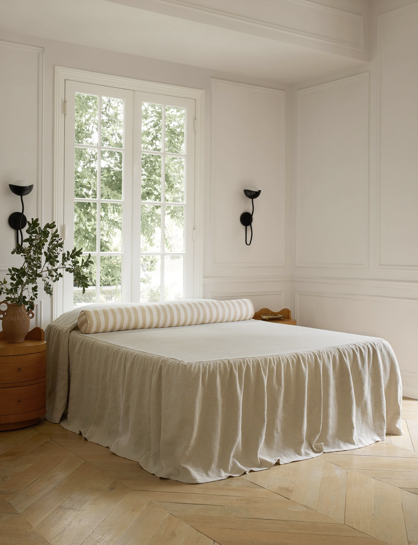
Draw a Clean Slate with Monastery Minimalism
If you’re tired of everything and craving a fresh start, invest in a simple, high-quality bedcover. Pull it over your two pillows and tuck it in around them so that your entire bed is one simple, beautiful surface. This also feels refreshing and casual for the upcoming warmer months, providing a sophisticated sense of serenity and ease.
Design: Sandra Weingort
I hope these ideas are inspiring! Here’s to throwing open those bedroom windows, letting in the fresh air, and enjoying a rejuvenated retreat!
SHOUT OUT LA Speaks to CALAFIA Home Design Founder Elizabeth Sims
In this exclusive interview, Elizabeth opens up about her remarkable journey, from the initial spark of passion to the thriving studio that exists today. She dives into her extensive background in art and how it drives her design work, and describes her father and grandfather’s small family business, and how it taught her the work ethic and respect for relationships that guides her business ethos. She also describes the origins of CALAFIA Home Design’s name, how it is connected to California, and why the golden state’s diversity echoes the beauty of her own family.
about art, design, family, and what inspires her most
When Shout Out LA recently reached out for a sit-down with our Founder and Principal Designer, she shared a story that is a testament to the power of determination and creativity.
In this exclusive interview, Elizabeth opens up about her remarkable journey, from the initial spark of passion to the thriving studio that exists today. She dives into her extensive background in art and how it drives her design work, and describes her father and grandfather’s small family business, and how it taught her the work ethic and respect for relationships that guides her business ethos. She also describes the origins of CALAFIA Home Design’s name, how it is connected to California, and why the golden state’s diversity echoes the beauty of her own family.
Elizabeth even outlines her ideal Bay Area weekend itinerary, providing a roadmap to all the local inspiration that keeps her creative practice rooted in this wonderful place. So, whether you’re looking for weekend ideas or insight into crafting an enterprise out of your own passions, read on here.
Welcome to the Design Log
Welcome to the Design Log!
I’ve created the Design Log to share what inspires me and encourage you to design your life beautifully. I’m excited to share sources, advice, and guidance on how to bring your vision to life, with or without a designer.
Welcome to the Design Log!
I’ve created the Design Log to share what inspires me and encourage you to design your life beautifully. I’m excited to share sources, advice, and guidance on how to bring your vision to life, with or without a designer.
This will be the space where I’ll indulge my passion for California’s design heritage, highlighting its influences, movements and most iconic homes. I’ll discuss my design ethos and talk about how I bring a room together, providing practical advice and links to my favorite sources. I’ll outline what it’s like to work with a designer, and how to get the most out of your collaboration. I’ll share what new products and brands move me, as well as how to avoid trends, and hone a design style that’s timelessly you.
Here’s to the design journey—thanks for following along!
Yours in the pursuit of beauty,
Elizabeth
The Edit | Kid’s Room Magic
Six ideas for bedrooms that capture the magic of childhood.
A child’s room should be a pocket of magic at harmony with the family home; a space worthy of the precious memories created there. We all have those memories—who hasn’t rummaged through an old box of keepsakes and turned up a small worn object that brought back all the innocence, wonder and immediacy of those days? I remember the antique embroidered chair that my grandmother bought me, which I used to sit at my art table, and the fringed lamp that cast shadows around my small room while I drew by its light. These items were a bit impractical, but they inspired me to dream. Below is my guide to creating a nest for your little dreamers: magic in six steps.
1.
Stick with Your Style… Plus a Pinch of Fairy Dust
While its true that the short-lived decor of a kids’ room makes it the one place where you can get away with trends, I’m more inclined to make them classic. Fully themed rooms can feel discordant within a home, whereas kids rooms that continue the palette and style of the rest of the house feel connected—which is what little ones need most. The key is adding those little details that spark the imagination. So stick with your style, and then collaborate with your child on a few special elements, such as art or wall treatments (more on that later) that will set the space apart and make it their very own.
2.
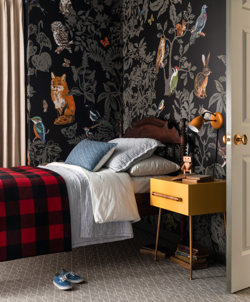
Whimsical Walls
Wallpaper or murals offer bold impact with low commitment, and can be selected to work with your decor. Above, the dark palette of this woodland wallpaper keeps it from being too busy, and complements the cozy antique furnishings and traditional feel of the home. In a modern home, a geo-centric mural could warm things up while maintaining a purity and freshness of design. Try Hygge & West, Cole & Son, or John Derian for creative but sophisticated designs, or commission a wall piece from an art student at your local college.
3.
Build an (Inclusive)
Library
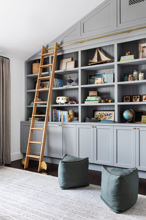
What’s more magical than a library? Books are portals to other worlds, and opportunities for children to travel anywhere and learn anything. Studies show that childhood literacy and access to printed materials is one of the highest indicators of future educational success. So, no matter the size, your child’s library of books deserves a celebrated place in their room. Consider a beautiful paint color for built-in or stand alone shelving, and style them with art or treasured objects. Add some plush seating and a reading light to encourage kids to settle in, or give you both a place to snuggle up together. Make library visits and book-gifting an anticipated tradition, and build your child’s library out ahead of their development, adding books for them to grow into.
Vintage series such as the Lord of the Rings, Little House on the Prairie, and Little Women can be an elegant addition, as can classic sets including titles like Black Beauty, the Wind in the Willows, and Robin Hood. Look for collections of stories and fairy tales illustrated by celebrated illustrators such as John Bauer, Kay Neilson, and Arthur Rackham. Shop at local, independent bookstores or look for self-published gems like Finding Aloha. Or shop online at Bookshop.org, which donates to local bookstores (you can even choose your favorite local shop!) and highlights collections of award winning, new, and inclusive children’s literature.
(To support childhood literacy in the US and around the world, visit Room to Read, Ferst Readers, and the Childrens’ Literacy Initiative!)
4.
Make Bedtime Special
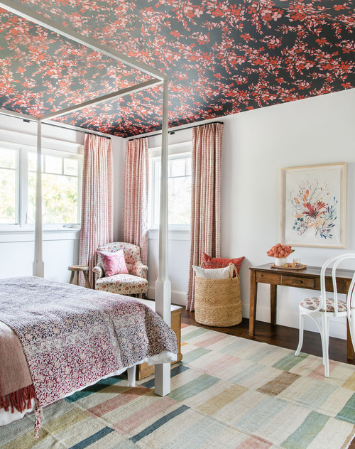
We’ve all been inspired by the trend of creative kids’ beds—beds built into alcoves, bunk beds with built-in staircases—but if it’s not in your budget or you’re hesitant to make such major additions to your home’s architecture, there are still plenty of ways to add magic to your child’s bed. One way to do it is to change the view; add a fabric canopy, tent, or wallpaper the ceiling (a twist on step two). Lighting can also add a special touch—consider sconces ( like this one in a floral linen), a pendant (like this colorful woven one), as well as dreamy nightlights (like this papier maché moon) for when it’s lights out. Upholstered fabric headboards are another easy way to add charm and warmth to a child’s bed (you can even DIY it!)—just select your fabric (I recommend St. Frank and Susan Connor), and work with a local upholsterer on a custom design.
5.
Start an Art Collection
If there’s one thing I hope to impress upon every client, it’s the impact that artwork has in making a house a home. Whether you’re buying prints on Etsy, collecting from artisans of your heritage culture, or investing in local emerging artists, art brings craft, culture, and personality to your home. There are no rules for art (though there are some good guidelines for installing it); art is a living thing with its own prerogatives. It doesn’t need to match the couch, or anything else for that matter. It just needs to make you want to look, and keep looking (the best art contains a bit of mystery). Purchasing real art for your child’s room is one of the best ways to add magic, and modeling art appreciation for your little one is priceless. To start your child’s art collection with a celebration of nature, I recommend Julia Lucey’s abundant etchings, Carolyn Lord’s luminous florals, and Michelle Morin’s intricate wildlife watercolors. For something more abstract, look at Claire Collette’s celestial geometry, Kelly Ording’s delicate graphics, and Lena Wolf’s quilt-like constructions. For dynamic figurative works, check out Michelle Blade’s mystical utopias, Joanne Ho’s tiny happy people, and Ana Leovy’s vibrant women. For other great ways to discover artists, look up gallery walks and open studios in your city, contact a local art advisor, or attend the spring MFA graduate shows of nearby art colleges.
6.
Make Room for Creativity
One of my first memories is sitting at a child’s sized table drawing a yellow flower with a stem that grew to the size of a tree trunk, and realizing I could create anything I wanted through art. All it takes is a table, a desk; anything in your child’s size that provides a place to build, shape, and make. Whether it’s a table and bench set from Ikea, a modernist S-shaped desk from Kinder Modern, or a play table and rabbit ear chairs from Ouef, that workspace is precious. Consider a gallery wall or bulletin board to exhibit your child’s creations nearby, and creative storage solutions to keep all their favorite materials handy.
So that’s it! Six steps to making a child’s room magic while celebrating its place within the family home—I hope you have fun dreaming, playing and creating together.
WORK WITH US
Principal Designer | Elizabeth Sims
e: Elizabeth@calafiahomedesign.com
Serving the Bay Area and beyond.

